How did your cooperation with 88 Films begin?
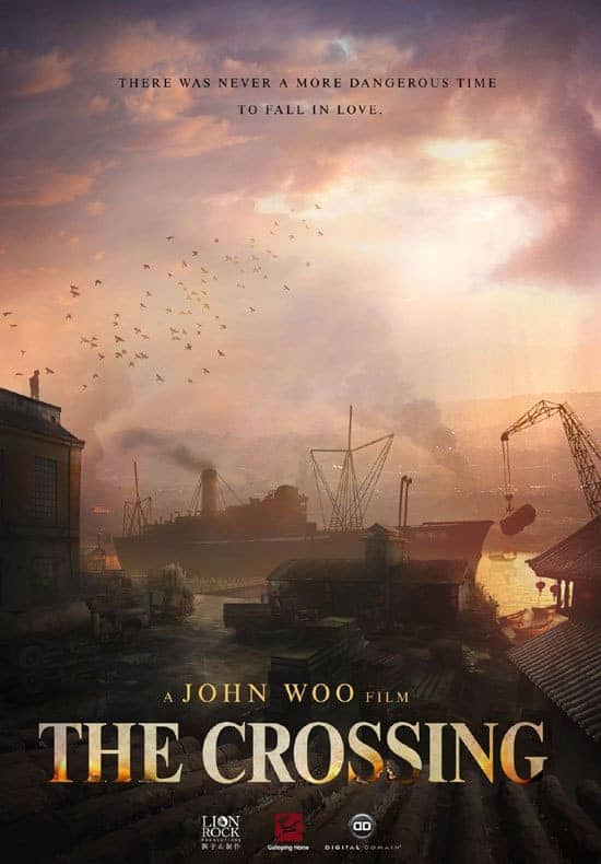
They had some covers done for their initial four Jackie Chan releases, and then they decided to try a different artist for the next four films. When they put that art out there it was not well received by the fans, there was kind of a backlash. Around that time, I was contacted by a gentleman who goes by Irongod2112, who does work for 88 Films, who told me he likes my art and was wondering if that would be something I would consider doing. He also told me that they needed them really quickly because they were behind schedule. I was actually completely booked up at the time, but… it was Jackie Chan. I am crazy for Jackie, I love his films, even the ones most people do not like; there is always something fun to be found in a Jackie Chan film, even in the ones that are not considered classic. And since they were talking about four films that I really like, “Crime Story”, ” The Protector”, “Dragons Forever” and “Miracles” I felt like I could not say no. In addition, I had been collecting 88 Films for a while, and it seemed like a company that really cared about what they were putting out. And it turned out that they are a really great company. They treated me as good as any company ever has. I had to work day and night to finish the jobs I already had and also to complete these four covers, and since they were so important to me, I could not just rush them, I had to give my very best. In the end, they liked what I did for them, there was a good reaction from the fans, and they asked if I was interested to work on more Jackie Chan films they were going to release. I accepted, and then they asked me to work on John Woo's “Heroes Shed no Tears” and immediately I accepted. That is how it started and now I am booked to do about a dozen more covers for them.
My favorite of your works for 88 Films is the cover of “Spiritual Kung Fu”. Can you give me some details about how you came up with the artwork?
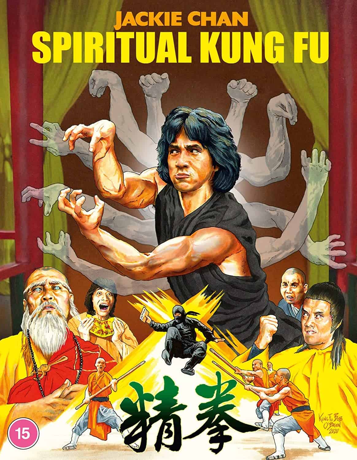
There are two things I always try to avoid when I am making a cover. The first is not to include anything that is not in the movie. Second, I try not to put any spoilers., although that is difficult because you want to appeal to the hardcore fans who already know the film, but you also want to attract new fans. For “Spiritual Kung Fu”, there are these very unique characters Jackie Chan learns kung fu from and I wanted to represent them, but they actually look very silly. The costume and makeup design for them is not my favorite. However, while you are seeing the movie, they are funny and their action scenes are so good that you get over it. On the other hand, if people who have not seen the movie saw these characters on the cover, it would probably NOT be good for sales. When I'm drawing, I'm definitely thinking how well my artwork will work commercially for the people who put my cover on their product. So I knew I had to represent these characters, but I did not want to show them fully. What I thought was, since they are teaching him and he is often seen in the film mimicking their moves as he learns, if I had them placed behind him and then show each of the five animal styles that they teach him represented them with a pair of their arms, it would give the feel of the film, without showing the characters essentially. Originally, I had the idea of their red hair flashing, peeking out from behind Jackie's figure so that people who knew the film would immediately recognize the characters. I started to draw it that way, feeling that it would also give Jackie Chan a nice red outline, but in the end, it just did not work the way I thought it would. Therefore, I decided to lose the red and I drew the background and Jackie on one piece of paper and then I drew all the arms of the ghosts on a second piece of paper. Digitally, I put them together and then adjusted the opacity of the other characters' arms to make them seem translucent. That's how that cover came about.
Can you also give me some details about the cover of Tom Mes's book, “Father, Son, Sword: The Lone Wolf and Cub Saga” you did for Arrow?
Those six films are among my favorite of all time, in any genre. The cinematography is stunning, the characters are just phenomenal, the action unforgettable. After I saw the movies I bought all the manga by writer Kazuo Koike and artist Goseki Kojima, and I watched the TV series made from the title, and the offshoot movies. To me, Tomisaburo Wakayama is the ultimate Lone Wolf. I feel like if I did not have to work for a living, I would just draw a new “Lone Wolf and Cub” picture every week, there are thousands of images and ideas I want to play with.
Anyway, they had already asked me to do the “Sister Street Fighter” cover for their collection, but they told me that before that, they had another project that they thought my style would be perfect for. When they told me what the work was, I felt like I'd reached a point I'd never thought I would get to, to be able to have anything to do with these films in an official capacity. It was really an honor. I said yes to them immediately, but I asked them to first ask Tom Mes if he was ok with me doing the art, because otherwise I would not feel comfortable. But then, they actually told me that they have already asked him, and he had said that he was going to suggest me doing the work in the first place. That was really nice to hear.
Regarding the actual art, initially I thought that although representing moments from the films is what I usually do, this time, I really wanted to present an image that would represent everything that Lone Wolf and Cub is about. As I am sure you know, a lot of people refer to the films as the “Baby Cart series”, so I knew that I needed to have the baby cart showing and I also felt that the son, Daigoro, is equally important with Ogami Itto. I also wanted to bring all those impressive battles we see in the films in one place, so I thought I should have him on a hill surrounded by enemies. The thing that always strikes me as so powerful is that after he cuts everyone down, they'll have this shot that shows the overall carnage. Therefore, I thought instead of showing the actual battle I'd show the aftermath, just all these bodies laying there, chopped down, with… maybe not “rivers of blood”, but small streams. (laughing) And also to have him just stand there, not looking the worse for wear, but just looking like he is thinking, “I just slaughtered a small army of people. That is what I do” (laughter).
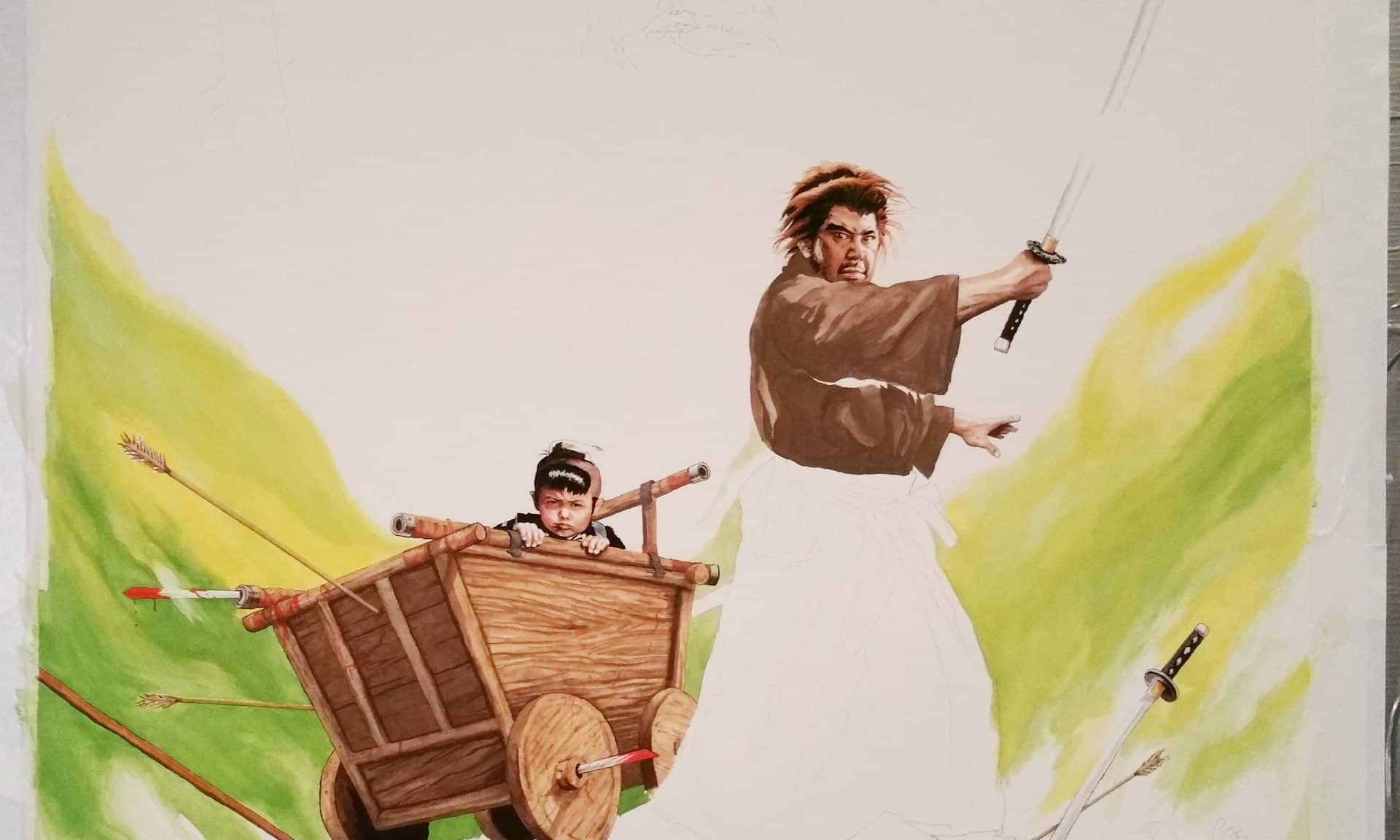
Furthermore, the films always had sort of an otherworldly quality to them and I thought that green in the background would make you think of the forest, although I did not want to paint the forest. I wanted to have more of the feeling of the forest. Initially, I wanted to have the face of Yagyu Retsudo, his face in the background leering down at Lone Wolf. But it looked too busy in the sketch, and keeping in mind this is a book cover, you need to have space for the text to appear nice and bold. I was pretty happy with the way it came out.
I also have a story about this cover. I get the job, I do the sketches and send them to Arrow, and thankfully, they pick the one I thought was the best, which made me very happy. I sketched the art out on a great big piece of watercolor paper, and wound up using water colors, markers, and a little bit of acrylic and a tiny bit with color pencil, and I did it really big so I could get the detail in the faces of Ogami and Daigoro. But the day before I was going to start painting, I was helping my son because he was moving. While we were carrying a refrigerator, my elbow got caught in the door jam, stopping me dead, and the full weight of the moving frig came onto my hand resulting in spraining my wrist. I could not believe it has just happened, but I had no choice but to continue with the move. However, the next day, when I was supposed to start working on the cover, my wrist, hand, and fingers were so swollen, I couldn't hold my paintbrush. I was on a deadline, and there was no time to waste. I was filled with desperation, but then I thought that I was supposed to be capturing the spirit of Lone Wolf and Cub, essentially of a guy who had a net with hooks dropped on him and has been stabbed and cut and beaten and trampled and still got up and did what he had to do to survive. I realize he is a fictional character, but I was inspired. So, what I did is, I took electrical tape and taped the paintbrush between my fingers and thumb, because, unfortunately, I am not ambidextrous, and I start painting like that. It took me about a week and a half, but thankfully, after the second day, the swelling went down and it was not so bad.
It is funny how into what you are doing you can get, I do not know about other people but I am a big nerd, so if I am drawing a monster, I'll catch myself quietly roaring and snarling while I am drawing or listening to the soundtrack of the movie. In the case of Lone Wolf and Cub, I listened to the great music of Hideakira Sakurai and Kunihiko Murai, in order to “take me there” put me in the right frame time.
Can you give me some details about how you came up with the artwork for Midori Impulse' release of “Robogeisha”?
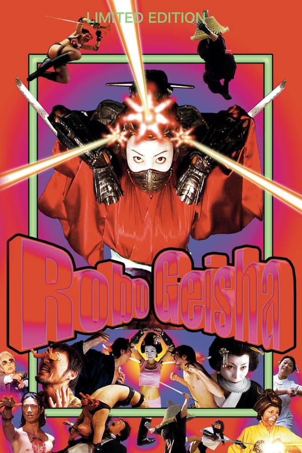
I was contacted by Oliver Georg, a very nice guy, and asked to do some covers for his company. I can't remember which one I did first, but “Robogeisha” was one of them. The film is extremely wild, and filled to the brim with astounding and unforgettable imagery. It was certainly difficult to decide what to depict on the cover with so much to choose from. I decided to make a very busy piece to keep in line with the movie's energy, and to hopefully capture the look of some of the frenetically composed Japanese posters of the '70s and '80s. This one was drawn digitally in Photoshop using a digital pen and tablet.
Are you working on anything else at the moment?
I have a couple of private commission projects I have been hired to do, more book covers for Scott Blasingame's action-fiction novels, cover work for TVP- The Vengeance Pack, Vinegar Syndrome, FilmArt and others, although I cannot really say anything more about the details. I will say this, though: among them there is a classic kung fu movie that has never been released properly. As a kung fu movie fan, I am very excited about this release. Actually… there are two upcoming releases like that coming to Blu-ray.